top of page
Logo branding | Fundry
Project goal
Welcome to Fundry. This is the premier English language learning center for adults. At Fundry, teachers understand the unique needs of adults who want to improve their English language skills.
This online school is designed to create a dynamic and engaging environment that promotes effective language acquisition. Task: to create a recognizable logo and identity for an English language school.
Solution

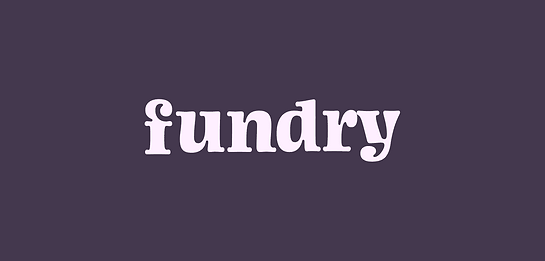
• Logo Concept:
Created a clean and modern logo incorporating elements symbolizing language and learning.
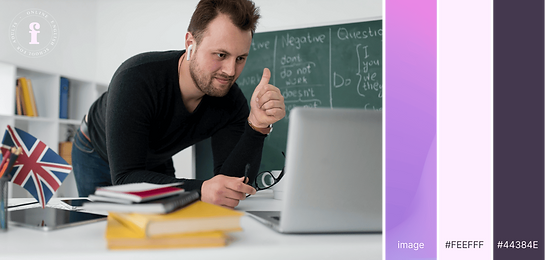
• Color Palette:
Chose a sophisticated and calming color palette. Use a combination of navy blue and purple to convey professionalism, trust, and commitment to quality education. These colors evoke a sense of stability and intelligence.
• Tagline:
Included a concise and impactful tagline under the logo to emphasize the school's mission.
• Typography:
Chose a modern Iowan Old Style font for the school's signature in the logo. This will provide clarity and legibility that is consistent with a modern and progressive style. Considered using bold or slightly italicized lettering to add dynamism.
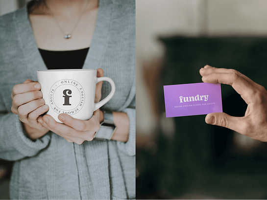
• Marketing materials:
Transferred the visual identity to marketing materials such as business cards, brochures, and social media graphics. Maintained consistent use of logo, color palette, and typography across all materials to create a cohesive brand presence

bottom of page